To start off my evaluation I annotated my final cover, contents page and double page spread against a current music magazine, I did this so that I could annotate what the two my magazine has in a common with a currently published magazine.
Front Cover

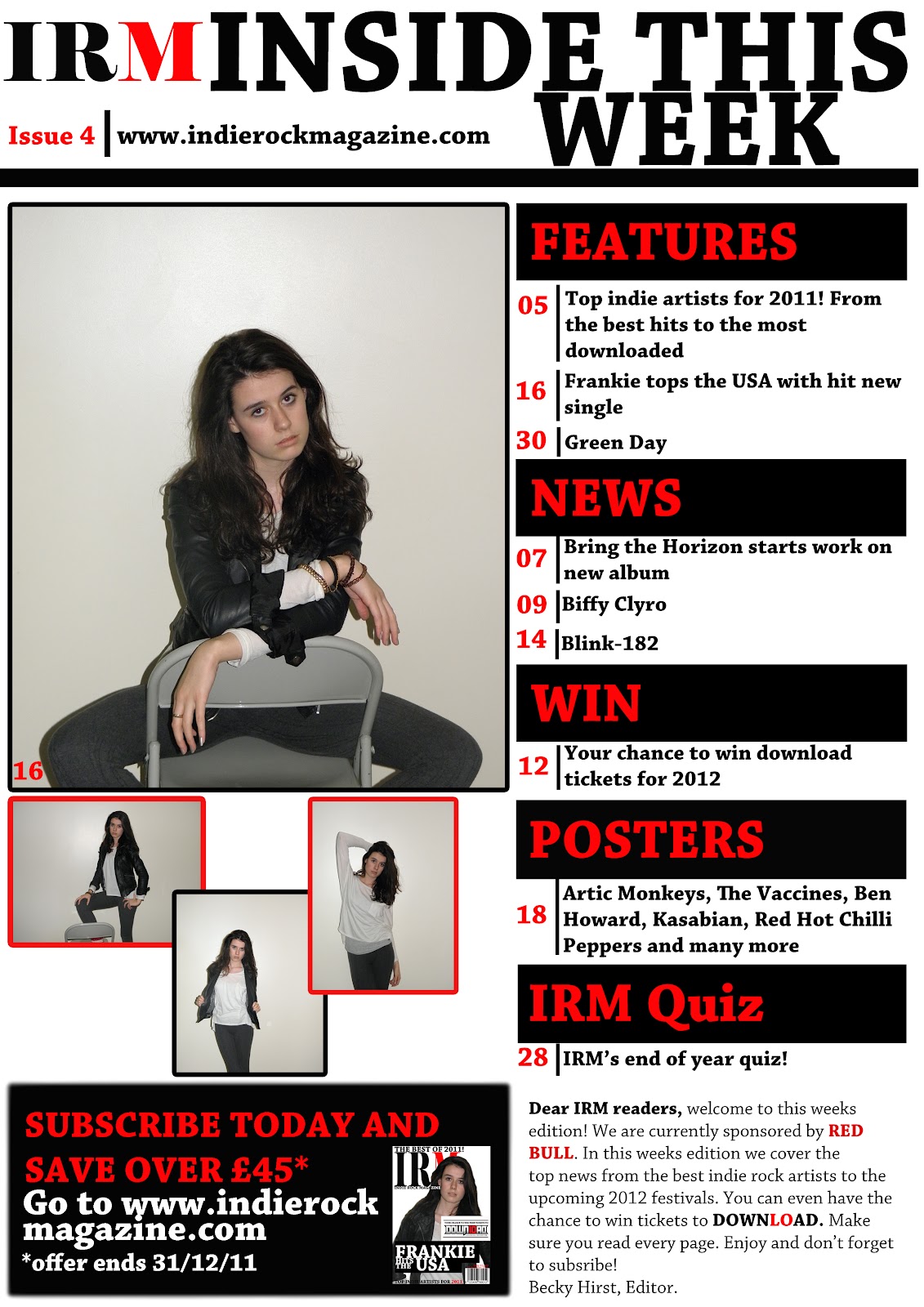
When I was making the front cover for my magazine, I liked the way NME had a 3 letter masthead so I took that idea and made it my own with IRM. I also used the way they positioned it in a large bold print in the left hand top corner of the magazine, by having this effect I thought it caught the reader’s eye immediately.
Also when looking at the NME magazine that I used as a template for the front cover of my magazine, I liked the way the put what the letter NME stand for underneath the title this was ‘New Musical Express’, by following this technique they used I put what the letters of my magazine IRM stand for underneath the title these were ‘Indie Rock Magazine’.
I also liked the way the picture was took as a medium close up showing from the waist upwards and the way he was looking at the audience immediately catching the audiences eye. I like the way he looked straight into the camera, so I tried to add the same effect with my photograph, making my model a large image overlapping the masthead, but not too much that it cut it out completely.
The last technique I used as a template for my front cover is where they had position the main cover line which said ‘Mark Ronson’ and how they had made it larger than the rest of the cover lines. I then used this technique positioned my text in a similar place but changed it to suit both my story and magazine. I then used two black rectangles as a background for this text so that it stood out more and caught the eye of the reader.
Contents Page

With kerrang magazine they had their contents page set out into different sections so that you can find what you are looking for easily. I used this technique with my contents using the black as the background colour and using red for the writing, I chose read and black because the colour work well together and they are the main colours of my magazine along with white.
I thought how they had a paragraph which was a small message from the editor was a good idea because it shows the magazine from the editors point of view and what was happening inside this week’s magazine from the editor. So I then did the same, wrote a small message briefing some of things that are inside this week’s magazine, who the current sponsor for the magazine is which I chose to be ‘Red Bull’ and basically selling the reader the magazine from the editor.
Also on this contents page there is a subscription box, this box gives you the chance to subscribe to the magazine if you are someone that is likely to buy every edition of this magazine buy subscribing the magazine you are likely to save money and sometimes if there is an offer on with that magazine, you are best to do it there and then and you are likely to save more money. So I decided to put a subscription box in included an offer where you could save over £45, therefore giving the readers chance to save money. Also within this box I gave them the instruction of visiting the magazine’s website where you can sign up to subscribe with this offer, also added that the offer ended at the end of that month so you had to do it within a certain period of time.
Double Page Spread

When creating my double page spread I didn’t really copy a specific page from another magazine I just used my own official ideas, maybe getting a few ideas from different pieces. On a page from kerrang magazine there was a pull down banner I used this idea as a feature within my double page spread, I used this banner to add question and answers.
Also on the same page there was a feature at the top where it stated which section of the magazine this page was in. So I took the idea of how they did it but changed it so that in my double page spread the first shape which was a square with a black background stated who had written the magazine and that it was an exclusive interview, this was written in white. Then in the next shape which had a red background it stated that this article was from the features section of the magazine this was written in red, I stuck to use the main colours of the magazine throughout the double page spread.
I used a pull quote on this page, I pulled the quote I thought would be most effective to the audience out and placed it in the middle of the article, making it bolder and larger so that it stood out and caught the reader’s eye. I then added a picture at one side of the magazine for the main image of this article this shows who the article is about.
How does your media product represent particular social groups?
How does your media product represent particular social groups?
I made my magazine to represent the age range of both male and female from the age of 16-24. This specific edition is mare targeted at the female group than the male, but should still appeal to both genders.
My magazine is stereotypical of people that have a taste in music that is both indie and rock genre, therefore it wouldn’t appeal to people that jazz music. Although some issues may attract people that like other genres such as r’n’b or pop depending on who is on how is on the cover of the magazine in that issue and what the content of the magazine is.
I aimed for my magazine to inspire people to be who they want to be, do what they want to do and most of all follow the music trend they want to follow. I wanted my magazine to represent the latest trends and music updates so that people have the opportunity to follow and like whoever they want too, it doesn’t tell them they have to like this music but gives them the choice to.
Before I started making my magazine I chose to aim my magazine at the C2, D and E socio economic groups I chose these because my target range is aimed at both genders aged 16 – 24 and I know that they may not be able to afford the real up beat classy expensive magazines, so I chose to aim it at these groups to create a magazine that was affordable but also had the content needed for to follow the genre of the magazine and to represent who the magazine is made to represent.
What kind of media institution might distribute your media product and why?
The publisher I chose for my magazine was Future Publisher. Future publisher is an international special-interest media group that is listed on the London stock exchange. It was found in 1985 publishing just one magazine and is now found in the UK, US and Australia creating over 180 special-interest publications, websites and events for people who are passionate about their interests.
I chose this group because they hadn’t published a magazine that covered the same genre as my magazine, they covered magazines such as classic rock to cycling plus, therefore I felt that they would be happy to publish my magazine. I chose this publisher in comparison to the Kerrang magazines publisher which is Beaur Media, because I thought that my magazine is similar to Kerrang therefore they may not want to publish another magazine as they will then be competing with themselves.
Who would be the audiences for your media product?
In the planning for my magazine I stated the target audience for my magazine to be both genders ages 16 - 24 within the socio economic groups of C2, D and E. At first I stated my magazine to appeal to people who like the pop/ r'n'b genre of music and was planning on sticking to this genre for my magazine. Later on in the planning off my magazine, once I had picked my model and chosen the articles I was going to have on the cover of the magazine I decided that it would be easier if I changed the genre to Indie/Rock as I felt that it suited my model more and the planning I had done for the magazine.
How did you attract/address your audience?
The socio economic group C2 is people who are skilled workers and have jobs such as an electrician or carpenter, I thought this was an appropriate group for my magazine because they will be getting an average wage not earning as much as doctors, vets etc but they are willing to pay £1.99 for my magazine.
The socio economic group D is people who are semi-skilled or un-skilled manual workers, jobs such as shop assistants or secretary's. I chose this as an appropriate group for the target audience of my magazine because I felt that people who would be classed as in this group would be interested in the magazine due to it's price as they would find it affordable.
The socio economic group E is people who may be unemployed, students, teenagers or people that may be living on benefits etc. I thought that this category was most suited to my magazine as the age range was 16-24, therefore teenagers and students fall into this target market. People who are in full or part time education or people who have a part time job or no job at all are not going to have the best financial background therefore would not be able to afford magazines that are higher up the market therefore my magazine would fit perfectly into their price range.
The special offer given on the contents page about saving over £45 if you subscribe now to this offer, will be appealing to these socio economic groups because it will mean that if they like the magazine but do not have the money to buy every single edition every week that they can subscribe to the offer and therefore save enough money for them to be able to get every edition of the magazine at a discounted price.
Audience Feedback


 In question 3 there is a total of 15 answers because some people put a ring around both indie a rock which gave me a total of 15 altogether.

I chose this group because they hadn’t published a magazine that covered the same genre as my magazine, they covered magazines such as classic rock to cycling plus, therefore I felt that they would be happy to publish my magazine. I chose this publisher in comparison to the Kerrang magazines publisher which is Beaur Media, because I thought that my magazine is similar to Kerrang therefore they may not want to publish another magazine as they will then be competing with themselves.
Who would be the audiences for your media product?
In the planning for my magazine I stated the target audience for my magazine to be both genders ages 16 - 24 within the socio economic groups of C2, D and E. At first I stated my magazine to appeal to people who like the pop/ r'n'b genre of music and was planning on sticking to this genre for my magazine. Later on in the planning off my magazine, once I had picked my model and chosen the articles I was going to have on the cover of the magazine I decided that it would be easier if I changed the genre to Indie/Rock as I felt that it suited my model more and the planning I had done for the magazine.
How did you attract/address your audience?
The socio economic group C2 is people who are skilled workers and have jobs such as an electrician or carpenter, I thought this was an appropriate group for my magazine because they will be getting an average wage not earning as much as doctors, vets etc but they are willing to pay £1.99 for my magazine.
The socio economic group D is people who are semi-skilled or un-skilled manual workers, jobs such as shop assistants or secretary's. I chose this as an appropriate group for the target audience of my magazine because I felt that people who would be classed as in this group would be interested in the magazine due to it's price as they would find it affordable.
The socio economic group E is people who may be unemployed, students, teenagers or people that may be living on benefits etc. I thought that this category was most suited to my magazine as the age range was 16-24, therefore teenagers and students fall into this target market. People who are in full or part time education or people who have a part time job or no job at all are not going to have the best financial background therefore would not be able to afford magazines that are higher up the market therefore my magazine would fit perfectly into their price range.
The special offer given on the contents page about saving over £45 if you subscribe now to this offer, will be appealing to these socio economic groups because it will mean that if they like the magazine but do not have the money to buy every single edition every week that they can subscribe to the offer and therefore save enough money for them to be able to get every edition of the magazine at a discounted price.
Also in this magazine I had set up a competition and given the readers chance to win tickets to the music festival Download. By doing this I was appealing this edition of the magazine to people who may want to go to this festival but can not afford to buy the tickets, therefore I am offering them a chance to win them and get to go to the festival. By putting this competition on the front of the magazine not just in the magazine it means that people who may not buy every edition of the magazine may buy this edition just for the chance to win the tickets. Also by doing this they may then decide that they like the magazine which they may then decide to buy the magazine more often which would increase the market of the magazine.
Audience Feedback


For my audience feedback I created a questionnaire (shown in the picture) and asked 5 Males and 5 Females to get a view from both genders I also asked people of a variety of ages from 16 - 45 to see what there point of views on the magazine where. I then put each question and answers into a graph so that the answers can be read easily. I also added a video of myself interviewing one of the audience from the correct target audience for my magazine to get a different and direct view on what they thought of my magazine.
 In question 3 there is a total of 15 answers because some people put a ring around both indie a rock which gave me a total of 15 altogether.
Question 10 and 11 where asking the audience about what they thought they could improve this magazine and what they thought where best about this magazine, some of the feedback I got back was;
"Front Cover catches the readers eye."
"The layout is very good and the images are too."
"I think the model on the photograph should be looking straight into the camera on the front cover."
"The layout and colour scheme is very good."
"The idea of posters and the 'ask your own questions' sections are a very good idea."
"Could include reviews of new groups/concerts/videos, singles etc or advertising events that are coming up."
From the answers to all the questions of my audience feedback questionnaire it has given me feedback to help me improve my work in the future and taught me different things I could add to my magazine to help it be improved.
What have you learnt about technologies from the process of constructing this product?
At the beginning of this task we learnt about how to smooth the skin of our model in Photoshop once we had taken our photographs and chosen the ones we want to use we got taught how to make the skin soft and perfect, how to get rid of any spots, freckles, make the skin look smoother, brighten their eyes and make size alterations to anything that you think may need it. Firstly we had to duplicate the layer and then select the area of the picture that we wanted to smoothen but as we only wanted to do the skin on her face and leave the eyes, nose and lips so that the picture doesn't look to fake, we had to switch to 'Edit in Quick Mask Mode' which was found in the tool box. Then we selected the brush tool and set it to around 25/26 soft edge. Once the brush was set to the correct size, we brushed over all the areas that we wanted to smoothen, the brush size was made smaller for some places to make it easier to use. Then by clicking the letter Q it selected the area that we had painted over so that you could see it clearer, leaving a dotted line around the shape that had been selected. Then we went to Select > Inverse > and then Select > feather and entered it at around 10px. Next we went too Filter > Blur > Guassian Blur and entered it at around 3px, this left the image looking smoother than the original image but it is also too smooth which makes it look quite unrealistic so to fix this we went to Filter > Noise > Add Noise and entered this at around 2/3%.
Also by doing this task I learnt how to use tools such as the quick selection tool this was mainly used to cut out images from the background and place them on the background that we had created for the picture. There was also the blur tool that I used quite a lot in this task. I mainly used this too smoothen the edges of different objects such as boxes that I wanted to look like they were blended more into the page rather than stuck on and also for the different images that I used throughout my magazine I used it on these to make them blend into the background also.
The transform tool was used quite a lot throughout my work as I used it to change the size of the image, text or shapes whether I wanted them smaller or larger. When changing the size of the image, text or shape I held down the shift button whilst altering the size as this made it re size evenly.
Looking back at your preliminary task, what do you feel you have learnt in the progression from it to the full product?

As you can see from the picture to the left the two seperate covers are very different, in not only type but style as well and the way that they are set out.
In the 'Wyke Voice' magazine you can't tell the main story from the other cover lines, this makes it confusing to the audience to see which one the main article is. Also the photograph on the front isn't related to any of the articles you can see, therefore the audience would be confused as to why he would be on the front cover if he wasn't anything to do with any of the articles. But you can see the difference in the music magazine from the college magazine as the mast head of the magazine is much larger and more visible against the white background, as on the college magazine it is large but could do with been larger so that it took up more room of the magazine which would fill up more gaps. Also the main cover line on the music magazine stands out a lot more than it does on the college magazine it is a lot bolder and bigger, placing it against the black background made it stand out even more and it made it obvious to the audience that this was the main cover line and that the artist on the from was who the magazine was about.
As you can see from the start of the magazine task with the college magazine to the music magazine I have developed many new skills and new ideas that have improved my work dramatically making it more professional. I have discovered how to take up the space of the magazine without cluttering the front cover with lots of different articles and how different colours work well together.

As you can see from the picture comparing the two different contents pages my skills and ideas for contents pages have changed a lot and developed to help my work look better and more professional.
The difference between the two are that on the college magazine I had written the word ‘Page’ next to the page number but on my music magazine I had just written the number therefore it made it look more professional and took up less space. The masthead of the contents page was more like one that you’d find on a professional magazine but on the college magazine all that I stated was ‘Contents Page’ I didn’t give it any relation to the actual magazine and it didn’t look very professional the pictures weren’t laid out well and there wasn’t enough pages for a full magazine. Therefore on my music magazine I filled it up with more pages so that it was set out like a professional weekly magazine.
Also I added the subscription offer and the editor’s letter to my music magazine these are features that are found in the majority of all magazines these days so I added them to my magazine. The editor’s letter was a good feature to add as it gives the readers the chance to read about the magazine from the editors point of view.